
Start with one bold focal piece—like tall greenery or a dramatic vase.
Stack items unevenly across your mantel to create natural rhythm, then leave white space so everything has room to breathe.
Ground everything with branches or greenery, mix metals and wood textures for warmth, and layer objects for dimension.
Repeat one color or material three times at varying heights to tie it all together.
These placement techniques will help your mantel look collected and polished.
Start With One Bold Statement Piece

Why does a mantel decorated with a bunch of small items feel so… blah? Because your eye doesn’t know where to look, honestly. You’re stuck in decorating limbo, and that’s frustrating.
Here’s the fix: start with one bold focal piece. Think oversized foliage or a tall, dramatic vase that commands attention. This statement element sets your mantel height and gives everything else purpose. You’re basically creating a visual anchor that says, “Look here first.”
Pair this bold piece with raised height using tall branches or vases. Suddenly, you’ve got vertical emphasis that makes your mantel feel intentional and refined. The thing that works? Your eye finally has somewhere to rest and admire. That’s the confidence boost your space deserves.
Stack Heights Unevenly Across Your Mantel

How’d you like your mantel to look intentional instead of like you just grabbed whatever was closest?
Stack your heights unevenly. Instead of lining everything up like soldiers, vary your pieces so your eye travels across the mantel with interest. Pair tall branches or vases as your main focal point with shorter items beside them. This creates a rhythm that feels natural and collected, not matchy-matchy.
Think of it like this—a short stack of books next to a towering vase, then a lower brass accent on the other side. The uneven heights give your mantel depth and make it look like you put thought into the arrangement. That’s good design right there.
Don’t Overcrowd: Let White Space Show

You’ve nailed the height variation, but now here’s where most people stumble: they fill every inch of that mantel like they’re afraid the empty space will judge them, which honestly, it won’t. The trick is leaving breathing room between your objects so your eye can actually rest and appreciate each piece instead of getting overwhelmed by visual noise. Think of white space as your advantage—it lets those textures and heights you’ve worked hard to arrange actually stand out without competing for attention.
Balance Through Breathing Room
When you’re styling a mantel, there’s this tempting urge to fill every single inch with stuff you love—and trust me, I’ve been there, staring at a bare shelf thinking “this needs more.” But cramming too many objects together actually makes your display feel messy and chaotic rather than thoughtfully composed. Instead, embrace white space as your essential tool for balance.
Here’s how to create breathing room:
- Mix focal pieces with smaller accents to prevent visual overwhelm while maintaining interest
- Vary heights, colors, and textures so nothing feels monotonous or cramped
- Step back regularly to assess whether your arrangement breathes rather than screams for attention
When you’re generous with negative space around your central focal point, you’re giving your eyes permission to rest. That’s when your mantel moves from cluttered to well-balanced—and that’s the Joanna Gaines approach.
Avoiding Mantel Congestion
Now that you’ve got the breathing room concept down, let’s talk about the flip side—because here’s the truth nobody wants to admit: we’re all tempted to cram stuff onto our mantels like we’re running out of shelf space tomorrow.
Stop right there. White space isn’t wasted space; it’s a practical tool. When you leave air space between pieces, your focal point actually gets the attention it deserves. Think of it like this: fewer, high-quality items with intentional spacing always beat a cluttered collection.
Joanna’s approach proves that restraint works. She strategically places tall vases, greenery, and accent pieces with breathing room between them. This spacing lets each item stand out without competing for attention.
You’ll notice your mantel feels calmer, more polished, and stylish.
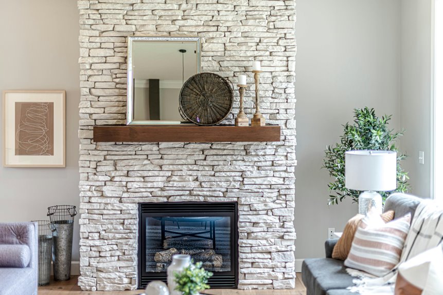
Ground Everything With Greenery or Branches

The key to a mantel that doesn’t look bare or awkward? Start with greenery or branches as your foundation. You’ll ground the entire display and create immediate visual interest that makes your fireplace feel deliberate and welcoming.
Think of tall foliage as your anchor—it establishes height and draws the eye upward. Pair these branches with rustic elements like woven vases to build layers and texture. Your greenery becomes the star, flanked by vintage brass accents that add warmth without overwhelming the space.
Here’s what makes this approach work:
- Fresh greenery or faux foliage serves as your primary focus, creating a naturally dramatic centerpiece
- Combining branches with wood and brass textures achieves that transitional style
- Hydrating plants or using water glasses keeps everything looking vibrant and alive
You’re not just decorating—you’re creating a cohesive, welcoming moment in your home.
Pair Metals, Wood, and Textured Vessels
You’ll want to mix different materials—think brass candleholders, wooden vessels, and woven baskets—because they work together to create visual interest without looking chaotic. When you layer these textures, you’re communicating that you’ve put thought into your choices, even if you’re still figuring out what works best. The key’s balancing heavier metals with lighter natural elements so nothing dominates the whole display, giving you that carefully arranged appearance that takes practice to develop.
Mixing Material Textures
One of Joanna’s covert tools for making a mantel look deliberate and polished is mixing different materials together—think brass, wood, woven textures, and ceramic vessels all hanging out in the same space.
You’re probably wondering how to actually pull this off without your mantel looking like a thrift store exploded. The trick? Layering creates visual depth that keeps eyes moving across your space.
Here’s what works:
- Brass candleholders paired with wooden bases ground your arrangement while adding visual warmth
- Woven baskets nestled beside metallic vases create contrast that feels collected, not chaotic
- Natural branches in ceramic vessels anchor everything together with organic texture
When you combine these textures intentionally, your mantel styling becomes something that feels deliberate and collected. You’re not just decorating—you’re creating a space that tells your story while making guests feel at home.
Creating Visual Balance
How do you actually keep your mantel from looking lopsided? You anchor both ends with matching brass candleholders. They frame your display and guide your eye across the space.
| Element | Purpose | Result |
|---|---|---|
| Tall Foliage | Creates height | Draws eyes upward |
| Brass Candleholders | Anchors ends | Frames composition |
| Woven Vessels | Adds texture | Softens hard surfaces |
| Wood Pieces | Grounds design | Connects to nature |
| Smaller Accents | Supports focal point | Maintains equilibrium |
Position foliage as your star, then balance it with smaller pieces on either side. Pair rustic textures—woven vases and wood—with vintage brass accents. This combination prevents your mantel from feeling top-heavy or cluttered. You’re creating a rhythm where nothing competes for attention. This is how you achieve the balanced look that makes visitors feel welcomed into your home.
Overlap and Offset Objects for Dimension

Creating real depth on your mantel doesn’t require interior design expertise—it’s about playing with layering strategically. Joanna Gaines does this well by overlapping larger pieces with smaller items positioned in front, which makes everything feel connected and deliberate.
Here’s how you can recreate that approach:
- Place candlesticks or skinny brass accents directly in front of bigger vases to ground the display
- Mix varying heights by pairing tall pieces with lower books, creating natural visual movement
- Offset objects asymmetrically rather than centering everything, which feels more relaxed and balanced
This approach adds dimension to a flat surface. You’re not cramming things together—you’re strategically layering pieces so your eye travels across the entire mantel, noticing new details that make the whole arrangement feel organized and deliberate.
Repeat One Color or Material Three Times
What makes Joanna Gaines’ mantels look organized instead of like a random collection of stuff you found in your attic? She repeats one color or material three times.
This simple trick brings order to your mantel. Pick brass, white, wood, or whatever appeals to you, then use it three different ways with varying heights.
| Item Type | Height | Material |
|---|---|---|
| Vase | Tall | Brass |
| Books | Medium | Wood |
| Ornament | Short | Brass |
This approach helps your mantel feel unified and coordinated. You’re not randomly placing objects; you’re building a display that shows you have a plan without being obvious about it.